For the Text Challenge, my goal was to create a composition that resembles a page torn out of my sketchbook. Normally I do most of my pre-quilt "sketching" on paper, in my head and on the computer.
But this time, a piece of white fabric was my paper and I used it to plan my next quilt. Whatever I would have done on paper or in my head, I worked it out on this fabric.
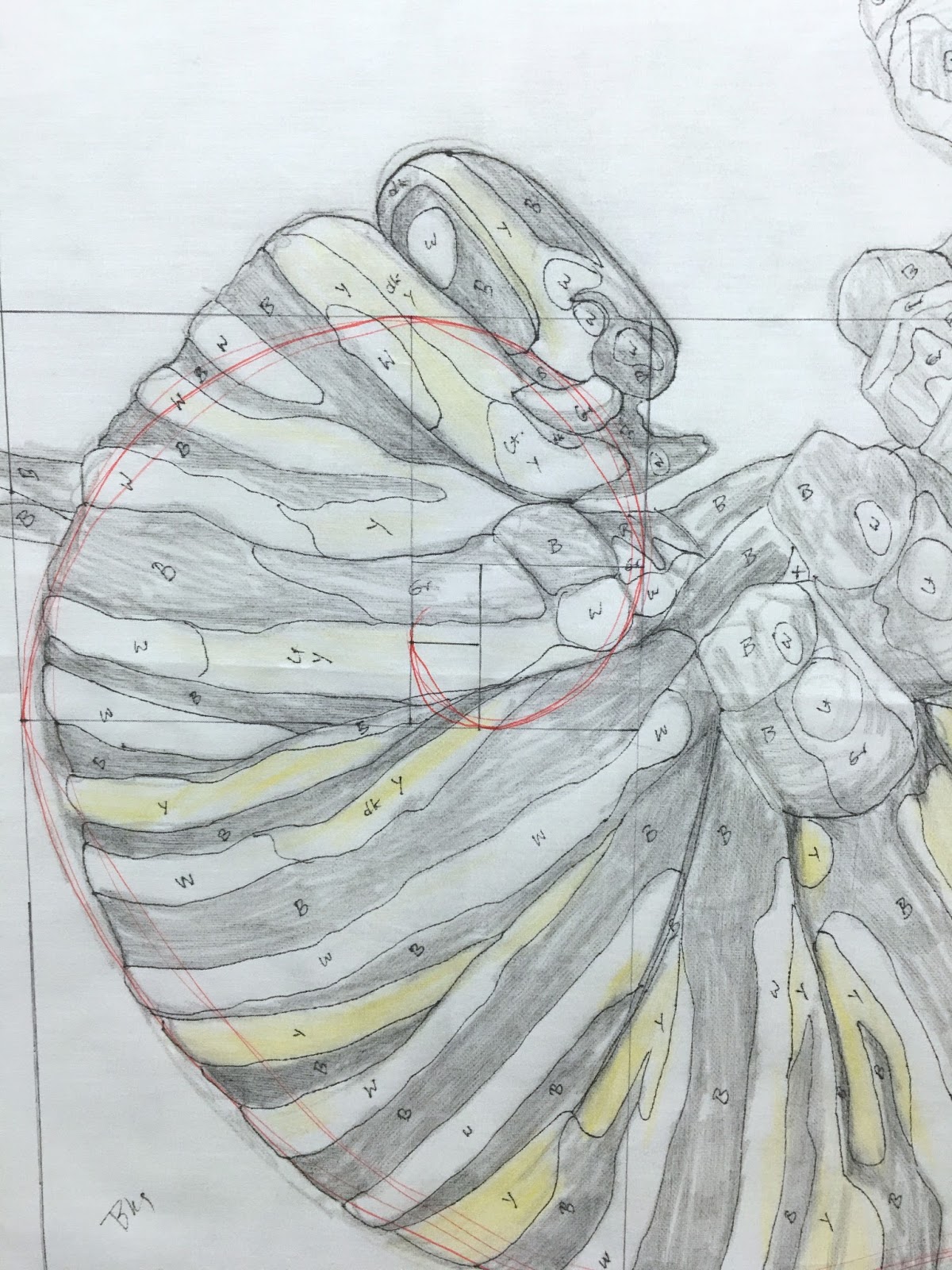
Using a ruler I first mapped out a rectangle in Fibonacci's golden ratio, then added a spiral with red marker.
From there I sketched out my design (in this case a Monarch caterpillar in the beginning stages of forming a cocoon) first in pencil then later with sharpie marker. I mapped out the color schemes and labelled it here as I would do on a paper pattern. Then I went about choosing the fabrics.
All the while, I made notes to myself about what this image means to me personally - how the caterpillar in a cocoon reminds me of the creative "hibernation" I've been in lately. Maybe the state of being dormant can be used as an opportunity to transition into something fresh and new.
So this piece is really a physical object representing my thought process.
This isn't technically a quilt by standard definition. Although I may add stabilizer to the back, I didn't want to quilt it with 3 layers. To me, finishing it as a quilt would make it too precious, too substantial and planned out. I really wanted to keep it looking like a thin sheet of paper; something I can add notes to anytime, or rest my coffee mug on, or cross things out and add new ideas etc. Like the caterpillar, it's not a beautiful thing yet. But it has all the potential.
So. Another update. I'm on vacation! I'll be outa here until July 21st, soaking up some extra sleep, sunshine and tiny cups of espresso along the seashore.
~K


